
You can spot some food logos from across a busy street, even before you can read a single word. Colors, shapes, and friendly mascots work together to stick in our memory for years.
Knowing how these logos work can help you understand why some brands feel like old friends. Here are some famous food logos that almost everyone can name in a heartbeat.
1. McDonald’s Golden Arches
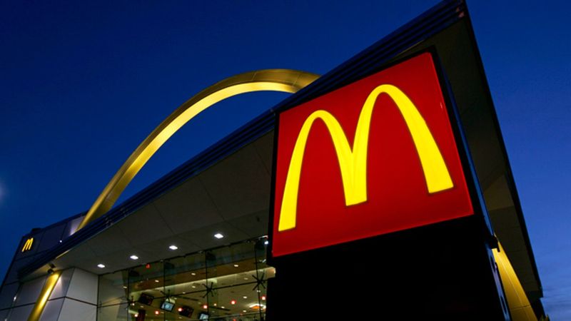
Picture a long family road trip. Suddenly a little voice shouts from the back seat, pointing at two yellow arches on the horizon.
Those golden arches began as real parts of early restaurant buildings in the 1950s. Later, designers turned them into the famous M we know today.
Fun fact: the bright yellow and red colors were picked partly because they grab attention and make people feel hungry. Pretty clever for a simple letter.
2. Coca-Cola Script
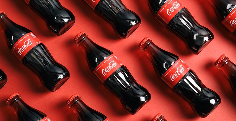
Back in 1886, a bookkeeper named Frank Robinson wrote the name Coca-Cola in fancy handwriting. He had no idea his pen strokes would travel around the world.
That swirly white script on a red background has barely changed in over a century. People in nearly every country recognize it, even if they cannot read English.
Next time you hold a can, trace the letters with your finger. You are touching real history.
3. KFC’s Colonel Sanders
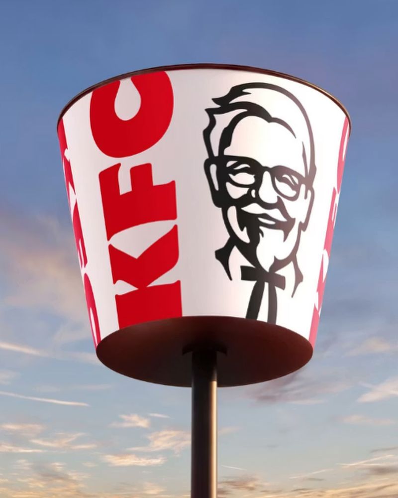
Few logos smile back at you, but this one does. Colonel Harland Sanders was a real man who started selling fried chicken at a roadside gas station in Kentucky.
His white suit, glasses, and little black bow tie became his trademark look. The company turned his friendly face into a simple drawing.
Kids today may not know his story, yet they instantly connect that grandfatherly grin with crispy chicken.
4. Kellogg’s Red Signature
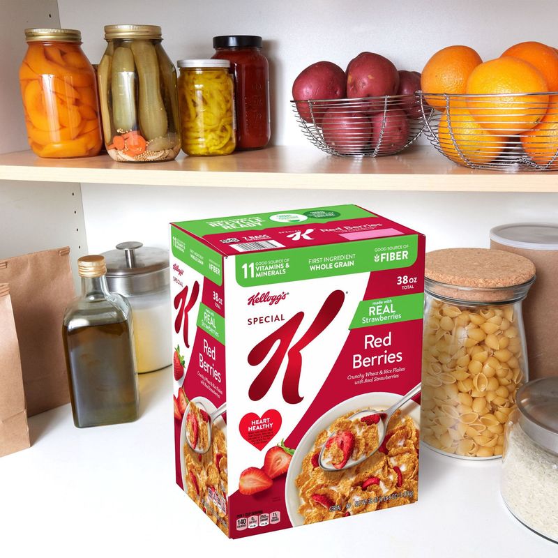
Breakfast tables everywhere have one thing in common: a red signature on a cereal box. It comes from the handwriting of W.K.
Kellogg himself.
He signed boxes to promise shoppers they were getting the real thing, not a copycat. That personal touch built trust fast.
Here is a tip for spotting smart branding. When a logo looks like a real signature, it feels more personal and honest to buyers.
5. Starbucks Siren
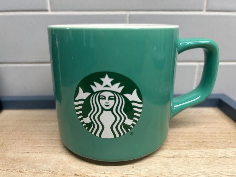
Ever wondered who that lady with the crown on your coffee cup is? Meet the Siren, a mythical sea creature with two tails.
Starbucks started in Seattle, a port city, so the founders wanted a nautical feel. The Siren was meant to lure coffee lovers in, just like sailors in old stories.
Since 2011, the logo has no words at all. The green mermaid alone does the talking.
6. Pringles’ Mr. P
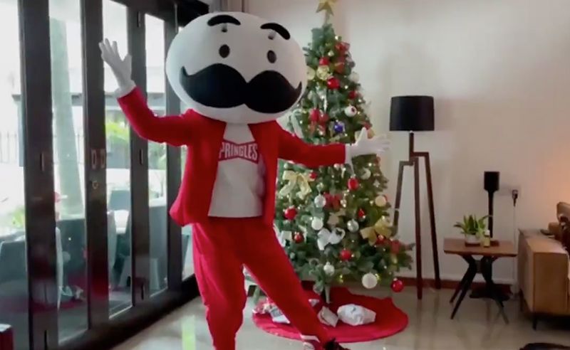
Mustache, bow tie, and a big round head. Mr. P might be the most cheerful face in the snack aisle.
His full name is Julius Pringles, and he has been on those tall tubes since the 1960s. In 2021, his look got simpler, with a flatter design and expressive eyebrows.
Quirky bonus: the inventor of the Pringles can, Fredric Baur, asked for some of his ashes to be buried in one.
7. Heinz Keystone
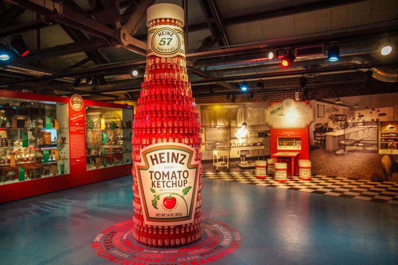
Some shapes quietly tell a story. The Heinz label looks like a keystone, the wedge-shaped stone at the top of an arch.
Henry John Heinz chose it as a nod to Pennsylvania, nicknamed the Keystone State, where his company began.
Look closely at a glass bottle and you will spot the famous 57 too. Heinz liked the number, even though the company sold far more than 57 products.
8. Nestlé Bird Nest
A mother bird feeding her babies in a cozy nest feels warm and caring. That was exactly the point.
Henri Nestlé based the logo on his family coat of arms, since his last name means little nest in a Swiss-German dialect. He wanted parents to trust his baby food.
Over time, the drawing got simpler. Originally there were three chicks, but now only two remain in the nest.
9. Burger King Bun
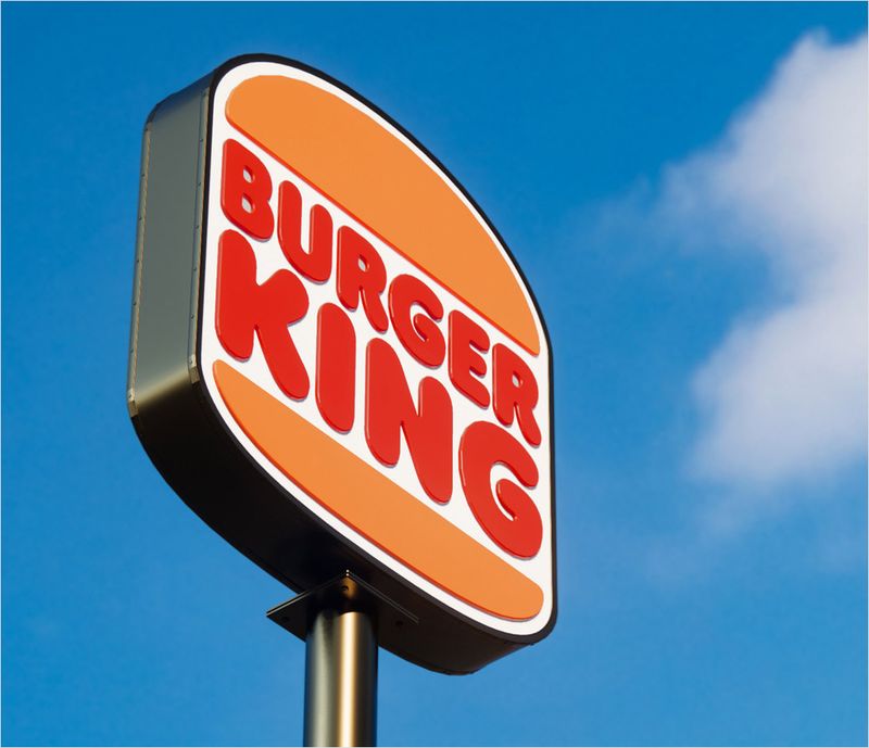
Hungry yet? Burger King’s logo practically looks like dinner.
The company name sits squeezed between two golden bun halves, just like a burger patty.
In 2021, the brand brought back a retro version inspired by its 1970s design. Many fans loved the throwback feel.
Smart lesson here: sometimes the best logo simply shows what you sell. No guessing needed when your name is wrapped in a bun.
10. Pepsi Globe
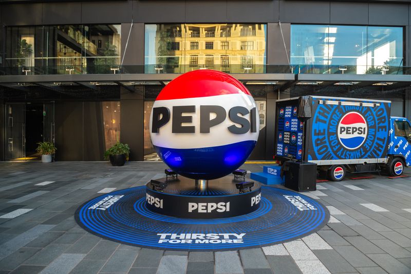
Red, white, and blue swirl together in a circle, and somehow everyone knows it means soda. The Pepsi globe first appeared on bottle caps during the 1940s.
Since then, it has been redrawn many times. One version from 2008 was even teased as looking like a smile.
In 2023, Pepsi brought back bold black lettering inside the globe. Logos can grow up, just like people.
11. Domino’s Domino Tile
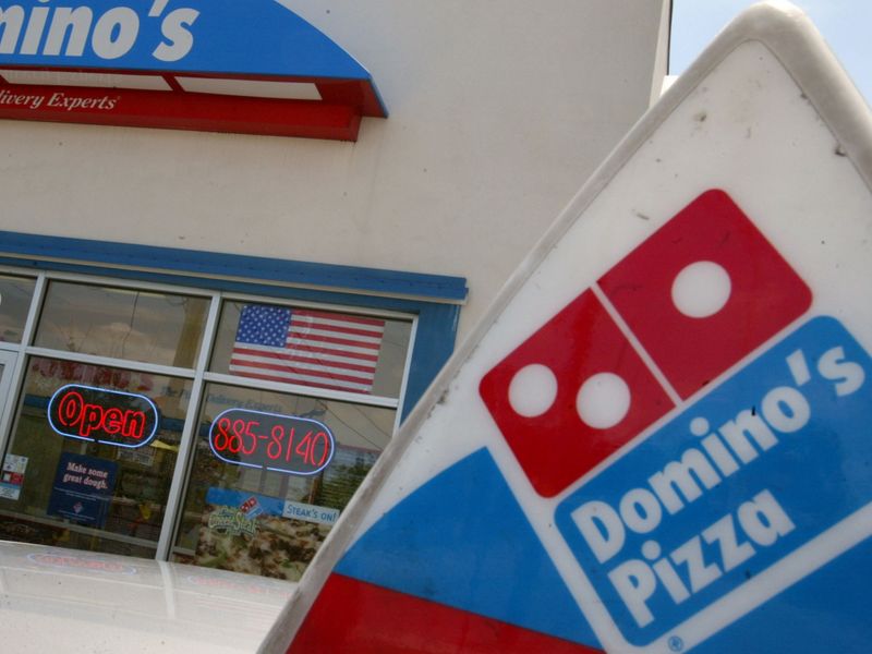
Count the dots on the Domino’s logo. You will find three, and each one has a story.
Back in the 1960s, the plan was to add a new dot for every new store opened. The chain grew so quickly that the idea was dropped.
So those three dots stand for the very first locations. Pretty fun detail to share during your next pizza night with friends.
12. Wendy’s Red-Haired Girl
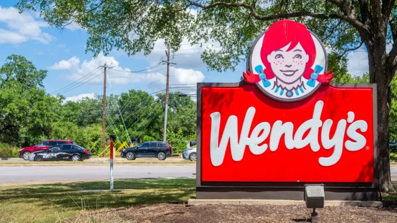
Red pigtails, freckles, and a sweet smile belong to a real person. Founder Dave Thomas named his restaurant after his daughter, Melinda, who was nicknamed Wendy.
Her cartoon face has greeted burger fans since 1969. Some people even claim the collar of her dress secretly spells mom.
The company says that was not on purpose. Still, it makes for a fun thing to look for next time.
13. Pillsbury Doughboy
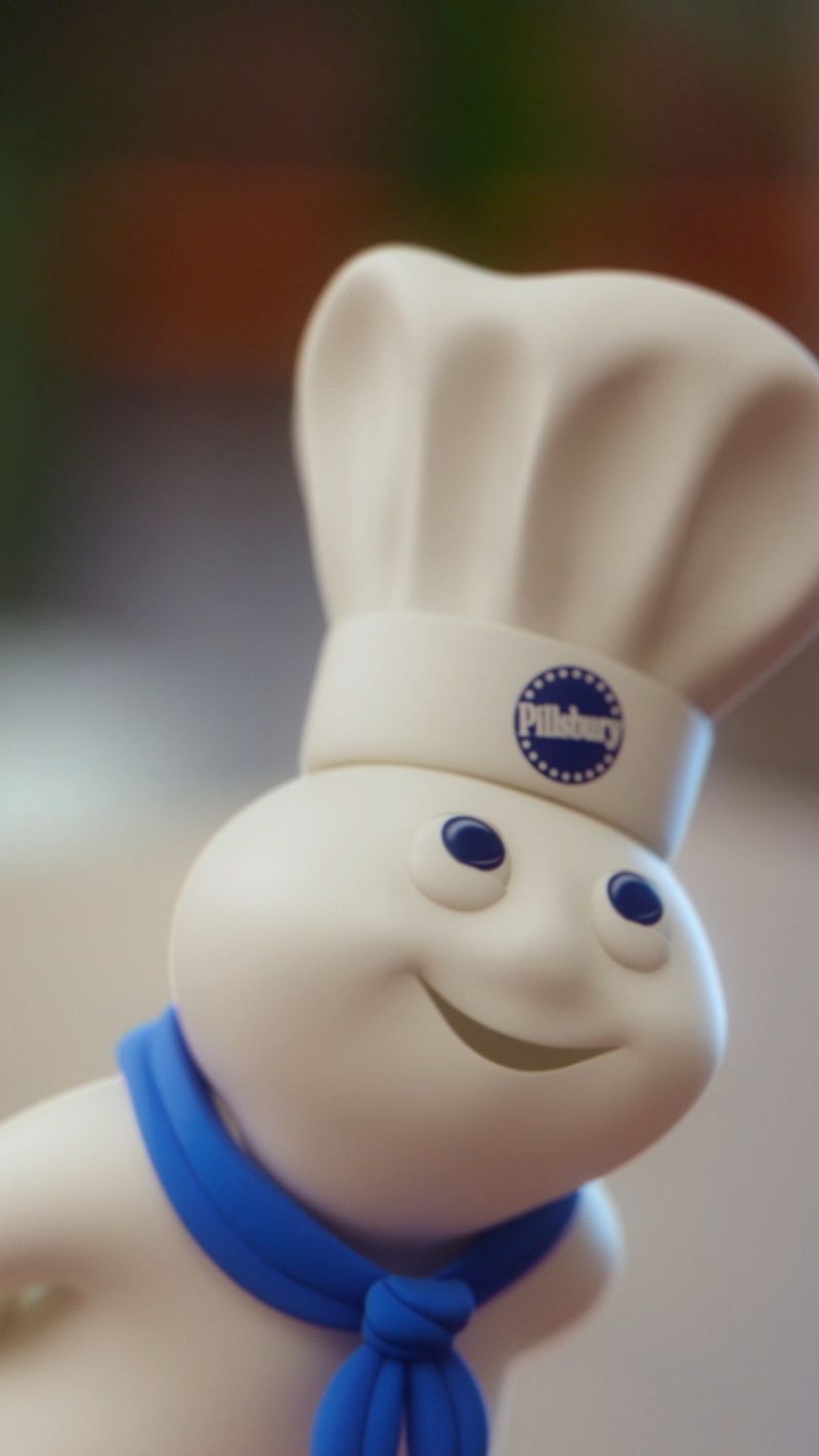
Hoo hoo! Just reading that giggle probably makes you picture a soft little figure in a chef hat.
Poppin’ Fresh, better known as the Pillsbury Doughboy, first appeared in 1965. Ads showed people poking his belly, and he always laughed.
Bakers love him because he makes cooking feel fun instead of stressful. Next time you bake cookies with family, give your own dough a gentle poke.
14. Subway Arrows
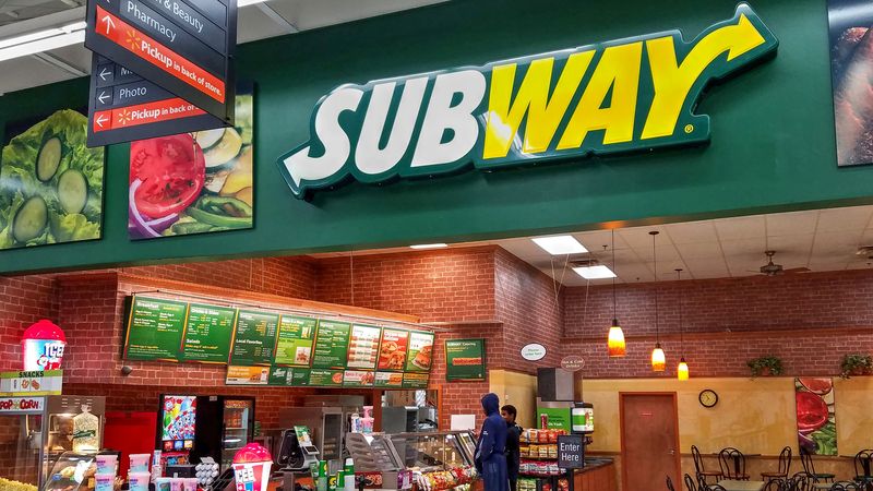
Arrows usually show you where to go. On the Subway logo, they point to your next sandwich.
An arrow sits on the S at the start and another on the Y at the end. Together, they hint at moving through a subway station and the way sandwiches get built down the line.
Green and yellow give it a fresh, veggie-friendly look. Colors really can whisper healthy without saying a word.
15. Taco Bell Bell
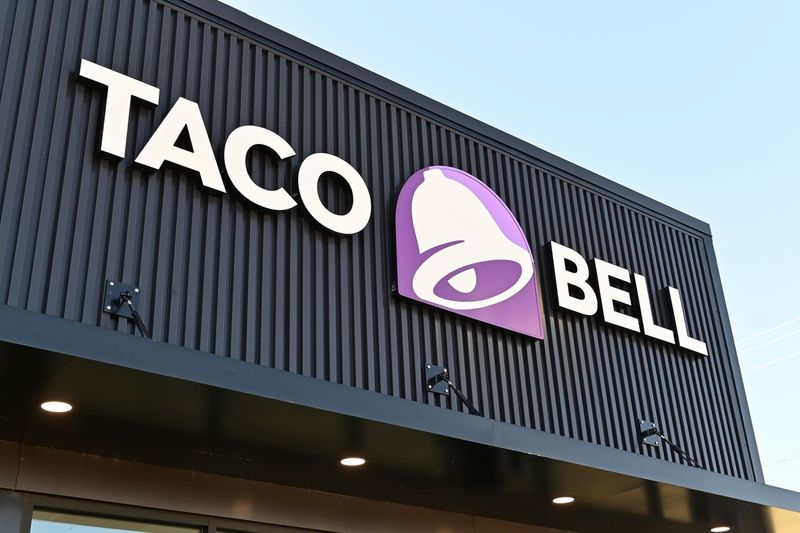
Ding ding, taco time! Taco Bell’s logo is a playful bell, and yes, there is a reason.
The founder was named Glen Bell, so the bell was a clever play on his last name. It also looks a bit like old mission bells found in California.
Today, the bright purple and pink colors stand out at night. Hungry late-night drivers spot that glowing bell from far away.
16. M&M’s Little m
Tiny but mighty, the white m stamped on every candy shell is a logo you can actually eat.
Mars started printing it in 1950 so shoppers knew they were getting genuine M&M’s. The letters stand for Forrest Mars and Bruce Murrie.
Try this at home: line up candies by color and see how many show a perfect m. Some get smudged, which makes perfect ones feel special.
17. Chupa Chups Daisy
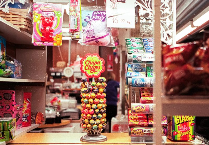
Believe it or not, a famous artist designed a lollipop logo. Salvador Dali, known for melting clocks, sketched the Chupa Chups daisy in 1969.
He reportedly drew it in under an hour while having lunch with the company founder. He also suggested placing it on top of the wrapper so it would always be seen.
Smart idea! That bright yellow flower still pops out from candy stands today.